
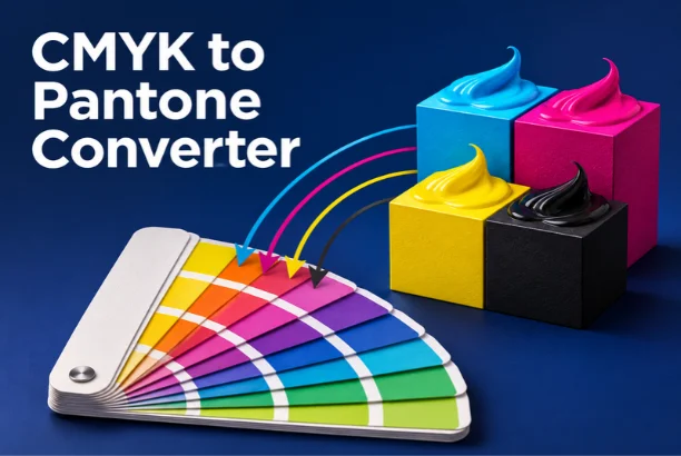
A CMYK to Pantone converter helps you find the nearest Pantone spot color to a CMYK process build. The result is normally the closest match, not an exact replacement. Paper, inks, press settings, and color profiles can change the final printed appearance.
Direct answer: Enter your cyan, magenta, yellow, and black percentages into a converter. The tool compares that color with Pantone references and returns the nearest matches. For important brand or production work, confirm the suggested color using a physical Pantone guide and a printed proof.
| What you need to know | Quick answer |
|---|---|
| CMYK | Four-color process using cyan, magenta, yellow, and black inks |
| Pantone | Standardized spot-color system used for controlled print color |
| Exact conversion possible? | Usually no; most results are closest matches. |
| Coated or uncoated? | Choose the library matching your printing surface |
| Best final check | Physical Pantone guide and printer proof |
| Common uses | Logos, packaging, signage, stationery, and brand materials |
Key Takeaways
* CMYK and Pantone use different methods to create printed color. * A converter usually identifies the nearest Pantone reference rather than an exact equivalent. * Coated and uncoated Pantone results can differ noticeably. * Screen previews should not replace physical print verification. * Brand-critical colors should be approved with your printer before production.
How a CMYK to Pantone Converter Works
A CMYK to Pantone converter starts with four percentage values. These represent cyan, magenta, yellow, and black process inks. The converter then estimates the resulting color and compares it with available Pantone references. More advanced tools compare colors using perceptual color models such as CIE Lab. Some also report a Delta E value for each possible match.
A lower Delta E generally means the colors appear more similar under the chosen comparison method. Pantone also provides conversion tools for moving between CMYK and nearby Pantone colors. Pantone explains that these conversions depend on printing conditions and should be treated as starting points. That distinction matters when color consistency affects a brand or finished product.
Why CMYK and Pantone Colors Are Different
CMYK creates colors by printing combinations of four process inks. Small dots of those inks overlap to create the appearance of other colors. This method works well for photographs, magazines, brochures, and artwork containing many colors. Pantone spot colors work differently. A printer can use a specifically mixed ink rather than building that color from four process inks.
This approach can provide stronger consistency for logos, packaging, and other controlled brand applications. These systems also have different color ranges. Certain bright, saturated, metallic, or fluorescent colors cannot be reproduced accurately with ordinary CMYK printing. A conversion therefore represents the nearest practical relationship between two different systems.
For more reading about digital presentation and visual content, Magzina’s guide to visual elements in email marketing covers how imagery influences communication. The underlying lesson also applies to print. Color choices affect how people recognize and respond to visual materials.
How to Convert CMYK to Pantone Step by Step
Converting a process build into a useful Pantone reference takes only a few steps. The calculation may be fast, but choosing the correct reference requires attention. Use the following process before sending artwork to production.
1. Write down the CMYK values. Record the cyan, magenta, yellow, and black percentages from your design file. 2. Open a reliable conversion tool. Choose one that clearly identifies its Pantone library and matching method. 3. Enter all four percentages. Keep every value between 0 and 100 unless the tool specifies another format. 4. Choose coated or uncoated. Select the option matching the paper or substrate planned for printing. 5. Review several close matches. Do not automatically assume the first digital suggestion is perfect. 6. Compare physical swatches. Check the shortlisted colors in a current Pantone guide under suitable lighting. 7. Request a printer proof. Approve the real output before a large or color-sensitive production run.
This workflow reduces the risk of choosing a color from a screen alone. Monitors display RGB light, while printed pieces reflect light from physical inks. Even a calibrated display cannot reproduce every press and paper combination perfectly.
Coated vs. Uncoated Pantone Colors
Pantone codes often include a letter showing the intended surface. A “C” generally refers to coated stock, while a “U” refers to uncoated stock. The same color family can appear different across those surfaces. Coated paper tends to hold ink closer to the surface. Colors can therefore appear cleaner, deeper, or more saturated. Uncoated paper absorbs more ink and may produce a softer or less intense appearance.
Choose the library that matches the actual printing material. Do not select a coated reference because its screen preview looks brighter. Your production surface should guide the choice from the beginning.
How Accurate Is a CMYK to Pantone Conversion?
No universal formula guarantees that every CMYK build has one exact Pantone equivalent. Pantone states that conversions can locate close colors, but printing conditions affect the result. Its Color Bridge system exists partly to compare spot colors with process equivalents side by side. Accuracy also depends on the converter’s underlying reference data. One tool may compare colors through Lab values and Delta E calculations.
Another may rely on approximate RGB representations, which can produce a different ranking. Use conversion results as a shortlist rather than a final production specification. For a social graphic or early mockup, an approximate result may be enough. For packaging, uniforms, signs, or brand materials, physical verification is the safer choice.
Magzina also covers virtual staging in real estate marketing. That article focuses on property photos, but it illustrates a broader point. Digital previews can influence decisions without perfectly reproducing the final physical environment.
What Does Delta E Mean?
Delta E measures the perceived difference between two colors. A smaller value generally indicates a closer visual relationship. Some modern conversion tools use CIEDE2000 because it accounts for human color perception more carefully. The number should still be interpreted within context. A small mathematical difference does not guarantee identical production on every substrate.
Lighting, surface texture, coating, ink density, and press calibration can change what you see. If a converter offers several matches, compare their Delta E values and physical swatches together. The second-ranked option may sometimes work better on the actual stock. Your printer can also recommend a more practical production choice.
When Should You Use Pantone Instead of CMYK?
Pantone is useful when repeatable color matters more than reproducing many colors at once. Logos and brand marks are common examples. Packaging, signage, promotional products, and corporate stationery can also benefit from specified spot colors. CMYK usually makes more sense for photographs and full-color artwork. It allows a printer to reproduce many colors using four standard inks.
That can simplify production for magazines, catalogs, posters, and marketing materials. Many organizations keep both specifications in their brand guidelines. They may define a Pantone reference for spot printing and CMYK values for process jobs. RGB and HEX references are often added for digital use as well.
If you manage a business website alongside printed branding, Magzina’s Magento 2 design and customization guide discusses maintaining a distinctive digital storefront. Consistent brand presentation should extend across print and digital channels. Color specifications help teams make that consistency easier to manage.
Common CMYK-to-Pantone Mistakes
The first mistake is treating a converter result as an official exact equivalent. CMYK and spot inks are different systems, so the nearest match may still show a visible shift. Always describe an automated result as a match or approximation unless verified. Another mistake is ignoring the final paper. Coated and uncoated stocks can produce noticeably different results from the same visual target.
Choosing the correct Pantone library before approval prevents avoidable production changes. A third mistake is approving color from a phone or ordinary laptop screen. Display brightness, calibration, and ambient lighting vary widely. Physical swatches and proofs remain more dependable for important print work.
Designers also sometimes convert a color repeatedly between RGB, CMYK, and Pantone. Every conversion can introduce another approximation. Start from the most reliable original specification whenever possible.
CMYK to Pantone Converter for U.S. Print Projects
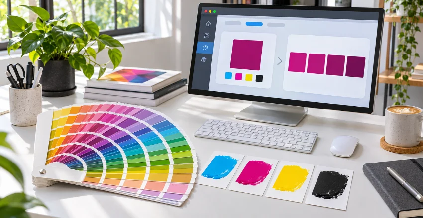
U.S. designers, businesses, print shops, and marketing teams often work across both process and spot-color workflows. A CMYK to Pantone converter can speed up early color selection when an existing file only contains CMYK values. It is especially useful when preparing logos, packaging, signage, labels, or promotional materials.
For professional production, involve the print provider before final approval. Ask which Pantone library, substrate, coating, and printing process will be used. Those details influence whether the suggested match will deliver the appearance you expect. Keep the approved color reference in your brand documentation afterward.
Record the Pantone code alongside CMYK, RGB, and HEX values when appropriate. That gives future designers and vendors a clearer specification for each medium.
FAQ About CMYK and Pantone Conversion
Can CMYK be converted exactly to Pantone?
Usually, no exact one-to-one conversion exists. The two systems create color differently and have different achievable color ranges. A converter therefore identifies the closest available Pantone reference for most CMYK values.
What is the best CMYK to Pantone converter?
The best CMYK to Pantone converter should identify its Pantone library and explain how matches are calculated. Tools using perceptual comparison can provide useful shortlists. Pantone’s own conversion resources are also valuable when working with official Pantone workflows.
Should I use Pantone Coated or Uncoated?
Choose the option that matches your final printing surface. Coated stock usually produces stronger and cleaner-looking colors. Uncoated stock absorbs more ink and can make the same shade appear softer.
Why does my Pantone match look different on screen?
Screens create color with RGB light, while printed materials use physical inks. Monitor settings, brightness, and calibration also affect what you see. The final printed sample can therefore differ from an online preview.
Is Pantone better than CMYK for logos?
Pantone can be useful when a logo requires tight color consistency across repeated print runs. CMYK remains practical when the logo appears inside full-color printed artwork. Many brand systems define both options for different production needs.
Do I still need a physical Pantone guide?
A physical guide is strongly recommended for color-sensitive production. It lets you evaluate printed reference colors instead of relying only on a display. Your printer can then confirm the selected ink against the planned stock and printing method.
Final Print Checklist
Before approving a converted color, confirm the original CMYK percentages and intended printing material. Check whether you need coated or uncoated Pantone references. Then compare the closest options instead of relying on one automated result. Review a physical Pantone swatch under suitable lighting before production. Ask the printer for a proof when brand accuracy matters. Save the approved spot color in your brand guide for future print jobs.
A converter makes the search faster, but professional verification makes the result dependable. Use the tool to narrow your choices, then confirm the final color on paper. That approach gives designers and U.S. print buyers a safer path from process color to spot ink.